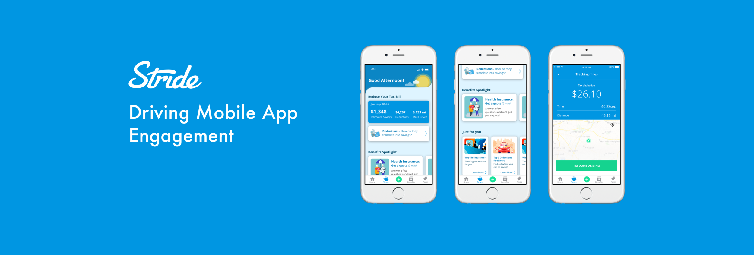
The Project
Problem & Context
The Stride mobile app began as a tool to help independent workers track their mileage and expense deductions for their taxes. While the product offered a valuable utility to our users, our team saw potential for more opportunities to provide value to solve problems independent worker across taxes, finances and benefits.
The product goal was to increase activation, engagement, and retention, but there weren’t any clearly defined user problems to solve beyond simply improving existing features. The challenge would be to discover and define unsolved problems for our users, and to ideate, design, and deliver solutions to user problems that might drive the key project KPI goals.
Project KPI Goals
Increase 7-day activation (user completes 3 core actions in 7 days)
Increase weekly active users by 50%
Increase 30-day retention by 50%
Increase revenue from Benefits purchases 25%
My Role & Team
For this project I was the sole designer and design lead, owning the entire design process end-to-end from design strategy, user research, ideation and wire-framing, user experience, visual design, prototyping, and engineering hand off/collaboration.
I collaborated closely on a daily basis with a product manager, as well as a team of 3 developers. Our team worked in a fast-paced Agile environment, using iterative and incremental releases to learn quickly and develop improvements over time.
Discovery
The Data: A Shifting Userbase
From the app’s inception, Stride considered the entire independent worker landscape as its core user base (gig work, real estate, massage therapy, etc.). However, analyzing the usage data told a different story: Our user base was shifting towards gig platform work, specifically delivery and rideshare. Gig platform users, who were lower income earners and had less contract work experience, had very different needs and behaviors than other contract workers (like real estate agents), who were higher income earners and more adept in contract work.
This provided an opportunity to reorient our focus on pain points for a specific user type that had been growing organically. By narrowing my focus, I would be more likely to discover problems that lacked solutions in the market.
User Interviews: Discovering “Jobs to be Done”
Instead of simply improving on existing features, I wanted to take a more generative approach to discovering problems and solutions for gig platform workers. I decided to use the “Jobs to be Done” (JTBD) framework, which is used for defining unsolved user needs. The basic premise of JTBD is that users “hire” a product to get a job done; and that innovation comes from the discovery of the job a user needs done, instead of “building a better mouse trap”.
Using the JTBD framework, I interviewed 20 Stride users who selected “Delivery” or “Rideshare” for their job category. For the interviews, I probed into their journey from beginning gig work, to them downloading the Stride app. By examining the contextual triggers and events that led them towards finding the Stride app as a solution, I was able to identify common problems or pain points users faced through their journey. The pain points without solutions highlighted “jobs” that Stride could do.
Above is an example of a user’s journey from beginning gig work with Postmates, to downloading the Stride app. The red “Thoughts & Feelings” bubbles denote pain points that the user can’t find a good solution for.
User Interview Takeaways
Examining events and triggers leading up to finding our product can illuminate user problems or “jobs” that Stride can do.
The most common thread among the users’ journeys were a lack of knowledge and guidance
13/18 users said they did not feel they can find guidance or support in navigating the 1099 world
10/18 users said they struggled with building habits to track their mileage and deductions
Vision Definition
After gaining insights about jobs to be done for our users, I worked with my product manager to define our vision of what the app could be. We started by orienting ourselves to the north star of Stride’s core mission and value proposition, then developed three pillars of how to achieve this mission based on the insights we learned from our users.
We then began a generative exercise of proposing feature and design ideas that would push the concepts of the three pillars of 1) Tools 2) Guidance & Knowledge and 3) Habit building. From there, we would have clear user story proposals that we could bring to engineering for estimates, and develop a plan for which ones to tackle.

Within each of the three pillars, the green post its are features and products that Stride already successful does. The red post-its are opportunities for features and concepts that Stride doesn’t have today.
Design Decisions
Home Page Redesign: An experience centered on guidance
The engagement goal for redesigning the home page was to drive engagement through content that educates users, and helps them to understand the value tools like mileage tracking, deduction logging, and tax estimation. Knowledge and guidance would then empower users to use the tools more efficiently, and build better habits.
Simultaneously, a monetization goal for the home page was to drive better conversion with Stride’s benefits marketplace products. I used the same strategy of using value driven content to educate and activate users into seeing the economic value of protection options available.

Drive Reminders: Building retention through habits
The most common issue preventing users from activating and staying retained is building the habits to consistently track their mileage. This was especially important as our data showed that users who tracked 3 or more drives in the first 7 days of having the app were 85% more likely to retain the next 60 days. Most users would forget to track their first few drives, and would start to feel anxious about catching up.
To solve this, I created a drive reminder tool that allowed users to set push notification alarms based on their driving schedules and behaviors.

Because our gig platform workers typically don’t use complex scheduling tools often, I wanted to use a paradigm that fit their mental models. I found that they were accustomed to using alarm applications on a daily basis, so I modeled the interaction patterns based on popular alarm apps.
Push Notifications: Creating engagement loops
Before the redesign, our mobile app team was not paying attention to what was happening outside of the app. Talking to users highlighted they had “set it and forget it” usage behaviors with the mileage tracking tool, and would often never get around to exploring other features in the app. This meant that in order to drive activation, engagement, and retention, I would have to use tools outside of the in-app experience, like push notifications.
I saw push notifications as a powerful tool to infuse into our app experience to do the following:
Step 1: Guidance & Knowledge: Promote a latent learning curriculum with consistent bite-sized educational content that helps them understand the gig work landscape better, and highlight where Stride’s tools can provide value.
Step 2: Feature Discovery: As users build knowledge, they will have a better understanding of the value Stride’s tools can provide. Push notifications can then alert them of the value building features in the app that they missed.
Step 3: Re-engagement & Habit Formation: As users begin activating, habit forming celebratory and motivational messaging can help drive retention. Re-engagement notifications can also keep users from churning out completely.

Tax Dashboard Redesign: Promoting positive behaviors
While the business profit oriented dashboard fit the mental model of professional contractors (eg. real estate agents, business owner, etc.), the design did not resonate with gig platform workers. I found that gig platform users instead wanted to know how much money they were saving and how much they might owe in taxes.
In addition, I wanted to redesign the tax dashboard to become more action oriented, versus the more passive and less interactive older iteration. The to-do lists and daily tax tips nudged the users to build habits and engage with the app.

Project Outcome
Increased 7-day activation (3 core actions in 7 days) by ~30%
Increased weekly active users by ~80%
Increased 30-Day retention by ~25%
Increase revenue from Benefits purchases ~15%
Increased to a 4.8 star rating on the iOS app store, with over 27,000 reviews

The Project
Problem & Context
The Stride Health product is a health care and insurance benefits marketplace for independent workers who don’t have access to benefits through a W2 job. The goal of the Stride Health marketplace is to make buying health insurance easier and faster, and to find the best plan for our users’ needs at the best plan.
Every year, Open Enrollment Period (OEP), from November through January, is our opportunity to help our users get health coverage and other ancillary benefit products they need, and for our business to generate revenue from product sales.
Project KPI Goals
Increase the % of users who receive health insurance subsidies
Reduce support calls into member experience by 25%
Increase health funnel conversion rates by 25%
Increase purchase of dental and vision sales by 50%
Increase purchase of ancillary products (life insurance, accident insurance, etc.) by 25%
My Role & Team
For this project, I worked with one other product designer, two product managers, three member support members, and a team of 6 engineers. Each designer was responsible for a different part of the health funnel and marketplace experience. My specific areas of the experience included the dashboard, subsidy calculator, shopping comparison tool, and visual design refresh multiple areas of the funnel experience.
My design responsibilities included user research, user experience, UI and interaction design, prototyping, and testing.
Process
Identifying Opportunities
To identify areas in the funnel to improve, I worked with Aron, product team, and the member support team to create an experience map to identify what high level parts of the journey users would experience pain points, confusion, or frustration.
To get a wide spectrum of perspectives, we created the experience map using insights from user testing, member support interactions and requests, and our funnel data analysis. While user tests would unveil usability issues, member support captured large scale insights about user confusion and knowledge gaps during the onboarding, shopping, and application processes. We also considered the data on where in the funnel user converted or churned while creating the experience map.
From there, I created a user flow mapping out the entire architecture of the marketplace experience, from onboarding, to closing out the application process. Doing this allowed me to pin point the exact screens in the experience to target for redesigns and optimization.

Funnel Analysis & Experimentation
We used a highly iterative and experimental approach to test and release our design solutions. We used funnel analyses with control groups so that we could run A/B tests with designs in the wild during the special enrollment period, to get insights on the release for open enrollment period.
From the funnel analyses, we would monitor things like bounce rates, conversion rates, engagement times, and other key KPI’s.

Design Decisions
Understanding Subsidies
The subsidy calculation page was a part of the experience that the member support team got the most calls about. I was able to collaborate with them to develop insights about the user problems. The most common knowledge gaps users had on the page were:
What a subsidy is and who qualifies for it
How household size and income factors into the subsidy calculation
What constitutes “gross income”
How to estimate and calculate their income for the next year
To craft solutions, I wanted to learn what strategies, mental models, and language the member support team used to help educate users and solve their problems on the page. I then applied these to the design decisions to ideate the solutions. These solutions focused on help content based on customer inquiries, interactive income calculators, and celebrations that highlighted the savings.
Dashboard Redesign
The dashboard of the experience served multiple functions:
A re-entry point for users to jump back into their shopping/application process
An end state of the funnel and application process
Dashboard for users to manage their purchased plans
A space to cross-sell relevant insurance products based on the users’s profile and needs

Overview
COMPANY
WeTravel is an online trip organizer tool and payment platform for small travel companies and group trips. Currently, WeTravel allows users to create custom booking pages for group trips, collect payments for trips, and manage booking and financials.
ROLE
Research, User Experience, Visual Design, Prototype
CHALLENGE
WeTravel was interested in implementing a payment platform for trip organizers and small travel companies to pay their vendors. Their hope was that the vendor payment hub would have a network effect by attracting a community of vendors through a simple and efficient payment platform, which would then bring in more trip organizers and travel companies to WeTravel.
While the founders had a very rough vision for the platform, they had no research on whether their current users or travel vendors would be interested or even willing to use the product. Even more challenging, the product would bring an entirely different user type, travel vendors, into the WeTravel ecosystem, and there was no plan on how to integrate these users into the current platform.
Final Product

Research
USE CASE 1: TRIP ORGANIZERS
For WeTravel trip organizers, I wanted to understand how WeTravel was currently delivering on its value proposition. I also wanted to understand their largest barriers and pains with paying their vendors and managing their payments, and how these factored into the holistic experience of booking a successful trip. Through interviewing the selected users, we found the following:

USE CASE 2: TRAVEL VENDORS
After understanding the needs and challenges of trip organizers, I conducted generative research on travel vendors to determine if they would find use in the vendor hub payment platform. I targeted travel vendors types that would typically transact with WeTravel trip organizers (transportation services, lodging, retreats, tours, etc.) in international locations that trips were often booked (Thailand, Costa Rica, Nepal, etc.). This posed an especially interesting challenging, because I wanted a range of international vendors, but I also needed to find common pain points and insights from a very diverse set of participants.
To gauge potential interest in the platform, I showed participants very rough mockups of the product, and asked whether they would find such a platform interesting and trustworthy. Through this quick comprehension test and user interviews I found the following:

COMPETITIVE ANALYSIS
I ran a competitive analysis on payment platforms and other travel organizing tools to see how they were addressing the user needs and concerns that we uncovered through user tests and interviews. I was especially interested in how major payment platforms built trust between their users when transacting large volumes of money, as this was a primary concern for users.
User Experience
KEY COMPONENTS
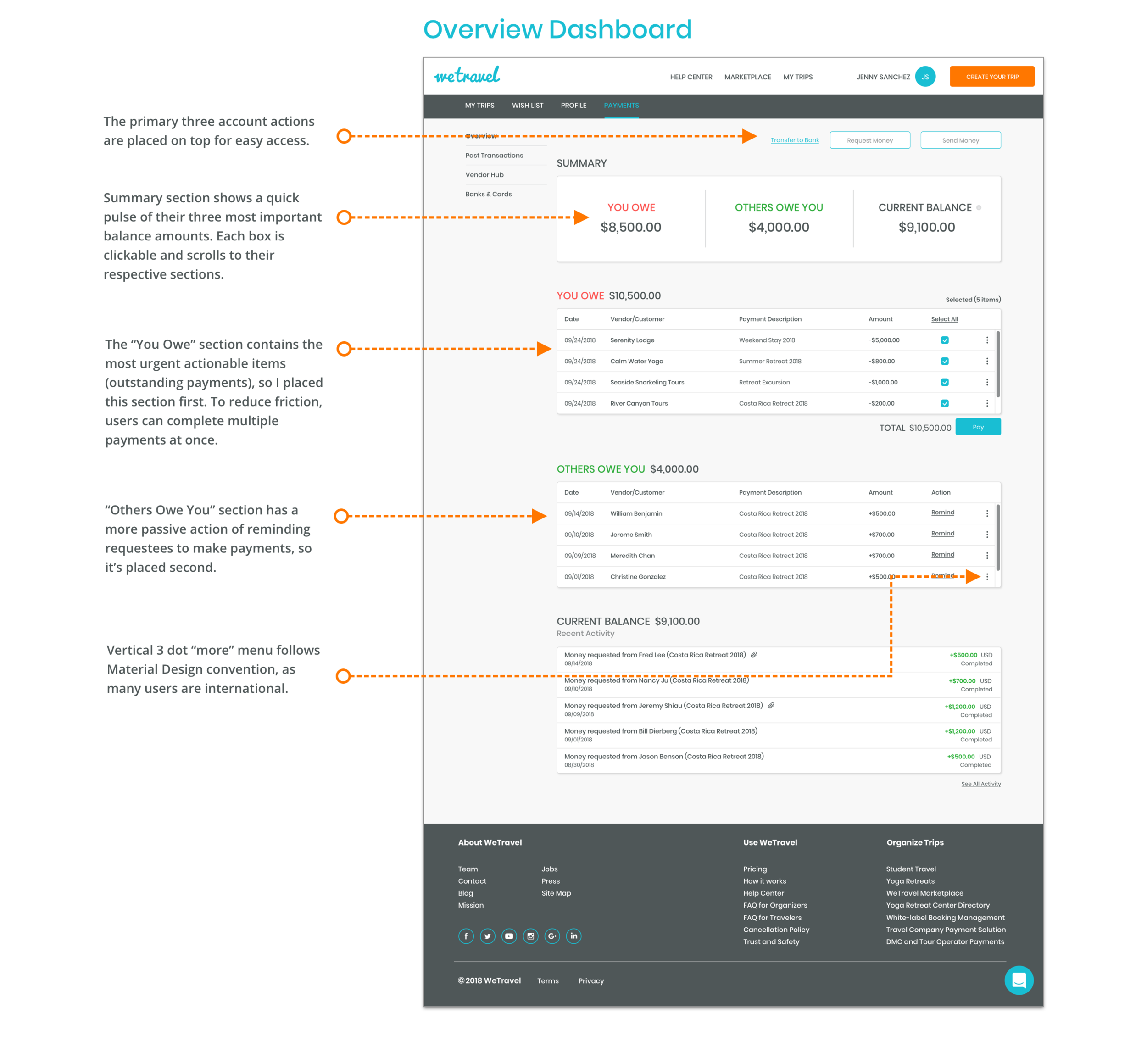
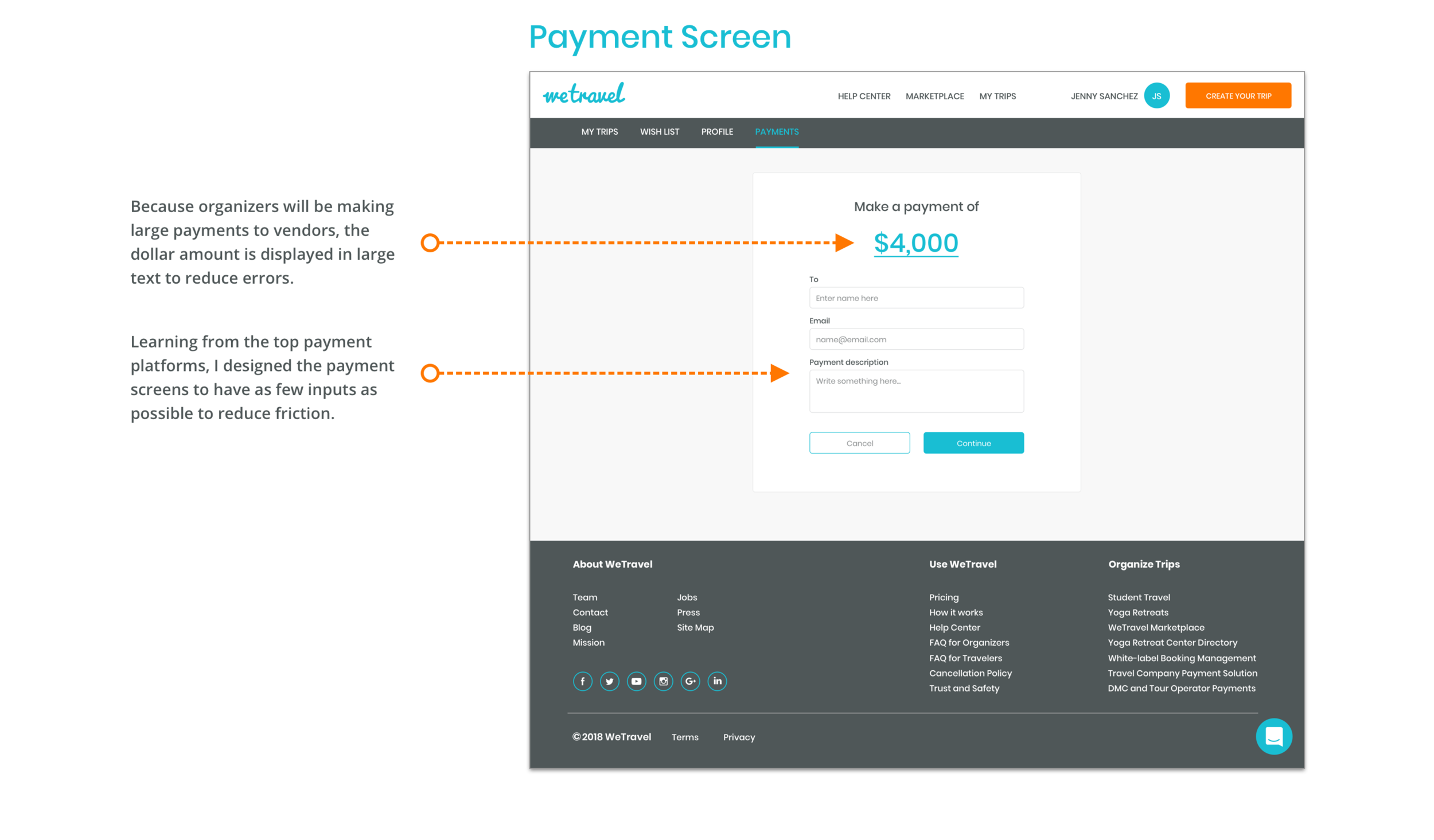
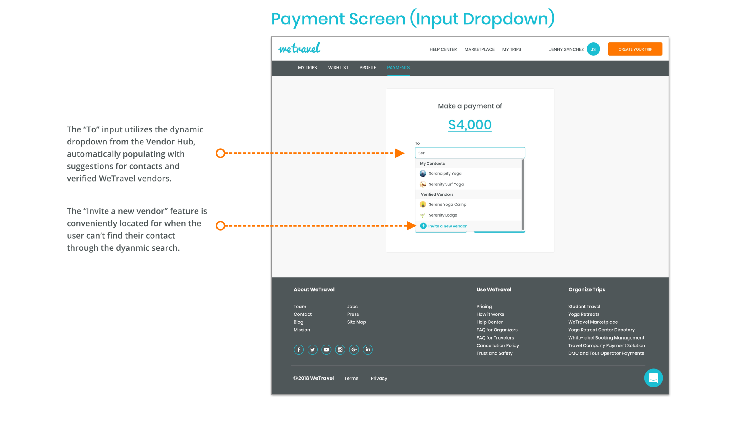
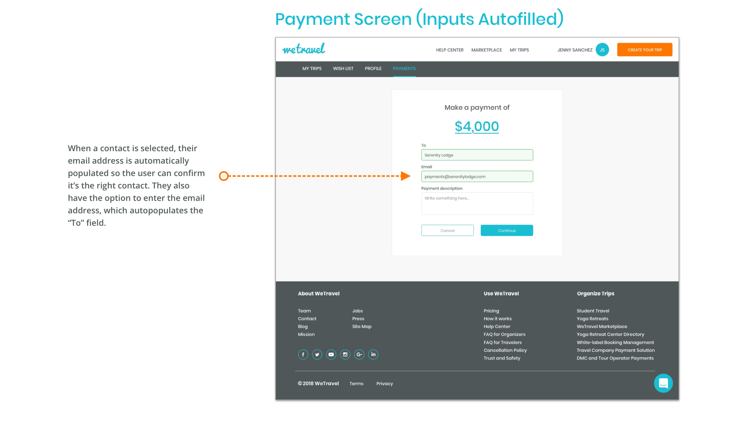
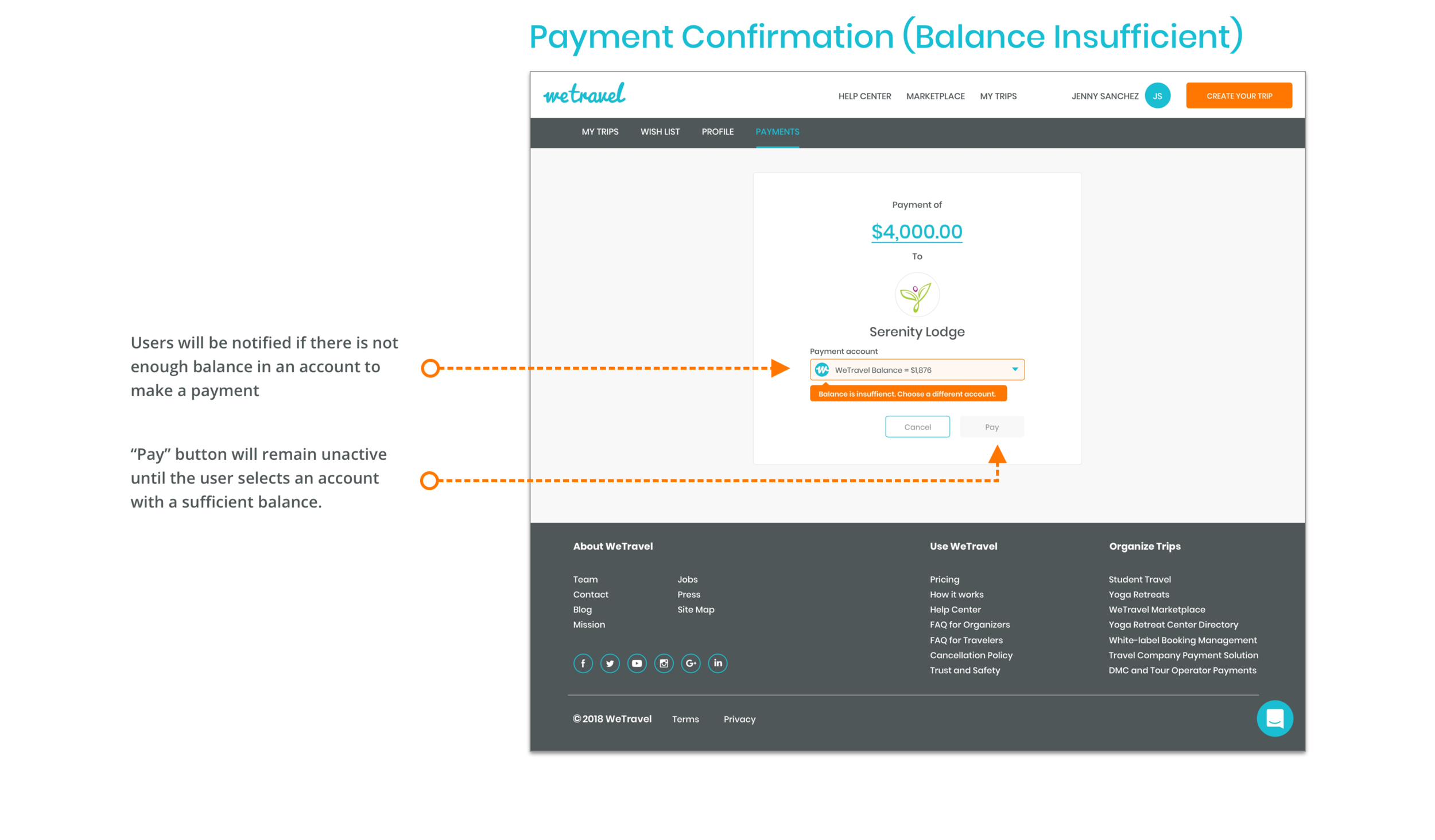
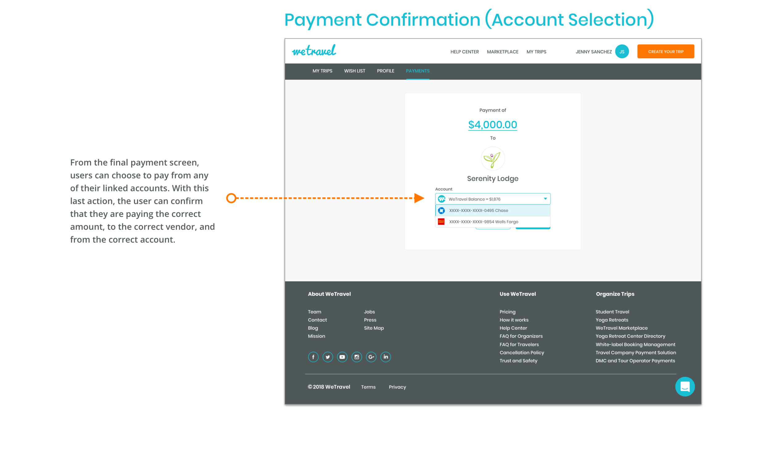
Through my research, I decided that the key features of the product should allow users to 1) store and manage their business contacts 2) see their transaction history and 3) handle outgoing and incoming payments. To achieve this, I split the payment platform into three key pages:

BUILDING TRUST WITH VENDORS
Based on my research, I understood vendors needed the familiarity of their existing customers in order to trust receiving payments through a new platform. To address this, a user's first contact with WeTravel needed to feel like it came from one of their customers. By designing the email invitation to look like a invoice sent from one of their customers for an outstanding purchase, I could build a feeling of trust and familiarity through the vendor's existing relationship with their customers.

CREATING VALUE FOR DUAL USE CASES
While the founders' vision for the vendor hub was to create more value for trip organizers, their current users, I wanted the product to create value for the travel vendors as well, as it would be essential to building out the community. This was especially important, as we found that users could potentially be acting as both vendor and a trip organizer, therefore needing both use cases of the site.
However, because the site would have a single view for both vendors and trip organizers, it was a challenge to build a product that would create value for both use case types simultaneously. This meant designing product features and crafting language that would be able to achieve dual purpose goals, especially on the dashboard and vendor hub contacts pages. Allowing vendors to request money was a very easy to implement feature that instantly created value and engagement opportunities, while also opening doors for them to invite trip organizers to WeTravel.
Design
EVOLUTION OF CONCEPTS
At each phase of the design process, I experimented with and tested different concepts and ideas. After settling on a sketch concept, a conversation with the stakeholders pushed me to include more features in the low fidelity wireframes. However, through testing the low fidelity prototype with users, I found that users experienced confusion on pages like the dashboard, where I tried to fit in too many features and action items. Using these insights, I reverted back to concepts from my original sketches for the high fidelity designs to simplify and declutter the interface.
INTEGRATION INTO THE EXISTING SITE
To create a product that would blend into WeTravel's existing interface, I followed their existing design system very closely, utilizing their same grid, design components, and brand elements. However, it was a challenge bridging certain interactions that would involve existing functionalities in the site. For example, to integrate the payment platform into the site, we had to completely redesign their existing "Banks & Cards" page in order for the interactions to bridge over to the new product.
Results
VALIDATION TESTING
After building a fully functioning high fidelity prototype, I tested it with users to validate the design decisions. Through testing, I found the following insights:

NEXT STEPS
For future iterations of the vendor payment platform, I would recommend exploring the following based on our research and testing:
Allow trip organizers to store and save documents related to payments and trips
Adding a purchase order and invoice generator to the payment platform
Allow trip organizers to create itineraries and easily share them with customers
FINAL THOUGHTS
Through building this product, I learned the importance of maintaining open communication with stakeholders through every phase of the design process. From the beginning of the process, I noticed that the founders often gave me little warning when technical constraints or project scope had changed, and I decided early on that I would need to proactively open up communication with them in order to keep the project on track. Once I initiated more frequent contact and discussion, the design work became much more of a collaborative process, with roadblocks being cleared earlier on.

Overview
INTRODUCTION
As a passionate follower of underground and independent music, I love the unique ecosystem Soundcloud has created for both creators and listeners to connect with each other. However, I believe that there is more Soundcloud could do to create a better experience for their users, both casual listeners and die-hard fans alike.
OBJECTIVE
Uncover and understand user pain points when using Soundcloud and ideate simple and achievable solutions to create a better listening and exploring experience.
SCOPE & LIMITATIONS
1. I do not work for, or have any professional affiliation with Soundcloud, and I made inferences on stakeholder objects and business goals based on assumptions and independent research
2. Usability testing was only conducted on listeners, and not content creators
OUTCOME
1. Reduced cognitive overload and friction in the music search process
2. Allowed users to find an artist's most recent music on their profile page
3. Made it easier to discover new music based on an artist criteria


Research
GUERRILLA USABILITY TESTING
To uncover user pain points, I conducted guerrilla usability tests in city parks around San Francisco. While the selection process was randomized, I was able to find a sample of 7 users that regularly used music streaming apps, and would be potential Soundcloud users.
For the tests, I ran users through common scenarios and tasks they might encounter when using Soundcloud to uncover any common pain points.
UNDERSTANDING USER & BUSINESS GOALS
Before the usability tests, I asked users about their music listening habits to understand their behaviors and goals when using music streaming apps. I also did independent research on Soundcloud's business to make inferences about stakeholder objectives. Through these research methods, I assumed the following priorities on each side:

Synthesis
AFFINITY MAPPING
After analyzing the user tests, I was able to gather data points by category and build common insights and patterns to synthesize. I found that users often struggled with areas where the Soundcloud's design didn't match with the users' expectations or mental models.
PRIORITIZATION
Using the business and user goals I established in the research phase, I was able to map out insights from the user testing on a 2x2 plot based on their importance to both users and the business. The insights in the top right quadrant became the key pain points I considered in my design solutions.
For users, I prioritized pain points that impeded usability, finding new music, and music discovery. For the business, I prioritized pain points that would keep users from being engaged, returning to the app, or from subscribing to the premium service.

Plotting the insights on the 2x2 allowed me to visually see the hierarchy of pain points by comparing each one's importance to user goals vs. business goals.
KEY PAIN POINTS
3/7 users had cognitive load and friction when searching for artists/tracks
6/7 users couldn't find recent music by a specific artist
6/7 users either couldn't find the "Station" feature, or did not understand its function to find suggested music
5/7 users expected to find a "suggested artists" section in the artist profile
3/7 user were distracted by the top card of the artist profile page, and were not aware of its functions
Design
DESIGN FOCUS
Finding the key pain points allowed me to focus my design solutions on specific areas:
Search page for artist & tracks
Highlight the artist/track they're searching for
Reduce cognitive load in the search process
Artist profile page
Create a clear section for recent music
Create a "Suggested Artists" feature and make the "Station" feature more obvious
Make the top card of the artist profile more functional and less confusing
DIVERGENT IDEATION
After establishing the design focus, I began crafting rapid pen and paper sketches to ideate a wide variety of solutions for each feature on each page. This process of high speed and high volume ideation allowed me to efficiently develop a large bank of divergent concepts to draw on.
CONVERGENT IDEATION
Using my pool of divergent concepts, I drew on the best ideas and converged on solutions that not only solved the problems, but were also achievable and realistic. This meant avoiding breaking Soundcloud's current interaction designs. Because the key pain points were not caused by visual elements, I also maintained Soundcloud's colors, branding, typefaces, and visual components to stay within their design system.
Results
PROTOTYPE & VALIDATION
After drafting the high fidelity designs, I created a prototype of the Soundcloud app to test and validate my solutions. Through testing the prototype with 5 users, I validated that my solutions had the following impact:
5/5 users found a specific track/artist through the search page, compared to 4/7 users before
4/5 users found music similar to a specific artist, compared to 1/7 users before
5/5 users found an artist's most recent music, compared to 0/7 users before
FINAL THOUGHTS
I was surprised with how many behaviors and pain points I could uncover with a few guerrilla usability test. I also found common issues with the Soundcloud app that affect key user goals that I would not have expected, even as a power user myself. However, through some very simple and feasible design changes, I believe that Soundcloud would be able to create a better experience for its users, and in turn, improve their business metrics as well.

